The Bus Walking Radius Study
Project Manager
Robert Guptill
Project Principal
Annette Demchur
Data Analysts
Sree Allam
Jonathan Belcher
Robert Guptill
Graphics
Robert Guptill
Cover Design
Kim Noonan
The preparation of this document was funded in part
by the Federal Transit Administration of the U.S.
Department of Transportation. The contents of this
report do not necessarily reflect the official views or
policies of the U.S. DOT.
Central Transportation Planning Staff
Directed by the Boston Region Metropolitan
Planning Organization. The MPO is composed of
state and regional agencies and authorities, and
local governments.
November 2012
This study analyzes potential route modifications and suggests several possible service plans for local bus system consolidation if the Massachusetts Bay Transportation Authority’s (MBTA’s) one-quarter-mile coverage standard was relaxed to one-third mile, four-tenths mile, or one-half mile, and the consolidated bus routes operated at greater frequencies. This modeling-based effort built on the MBTA Core Efficiencies Study and will help the MPO and MBTA better understand the implications of eliminating bus routes that perform poorly and increasing service on a number of transit corridors. It considers the best option for providing mobility and access through the bus network. The study also considers the impacts on equity and air quality for each of the potential consolidated systems.
CTPS wishes to acknowledge the assistance of MBTA staff, particularly David Barker and Daniel Webber, in providing the automatic vehicle location (AVL) data used in this analysis.
2 Coverage Analysis of the Existing System
2.1 Description of the Coverage Guideline
2.2 Coverage Analysis Methodology
3.1 Service Plan Development Methodology
3.2.1 Eliminations and Modifications
3.2.2 Service-Hour Reinvestment
4.3 Ridership Impacts by Route
4.4 Ridership Impacts by Neighborhood
| Figure |
|
|---|---|
2-1 |
One-Quarter-Mile Coverage by Street |
2-2 |
One-Third-Mile Coverage by Street |
2-3 |
Four-Tenths-Mile Coverage by Street |
2-4 |
One-Half-Mile Coverage by Street |
2-5 |
One-Quarter-Mile Coverage by Neighborhood or Town |
2-6 |
One-Third-Mile Coverage by Neighborhood or Town |
2-7 |
Four-Tenths-Mile Coverage by Neighborhood or Town |
2-8 |
One-Half-Mile Coverage by Neighborhood or Town |
3-1 |
One-Third-Mile Coverage: Proposed Services |
3-2 |
Four-Tenths-Mile Coverage: Proposed Services |
3-3 |
One-Half-Mile Coverage: Proposed Services |
| Table |
|
|---|---|
2-1 |
Coverage Guidelines |
2-2 |
Systemwide Coverage (Street Miles) by Threshold |
2-3 |
Percent of Neighborhoods by Percentage Grouping of Their Street Miles Coverage by Threshold |
3-1 |
Route Eliminations by Corridor by Coverage Threshold |
3-2 |
Eliminated Service Hours by Time Period by Coverage Threshold |
3-3 |
Average All-Day Percentage Headway Improvement by Corridor by Coverage Threshold |
4-1 |
Estimates of Daily Trip Impacts by Mode by Coverage Threshold |
4-2 |
Change in Transit Cost Metrics by Coverage Threshold |
4-3 |
Percentage Change in Average Daily Trips by Corridor by Coverage Threshold |
4-4 |
Top 10 Absolute Gains and Losses in Transit Trips by Coverage Threshold |
4-5 |
Percentage Change in Transit Cost Equity Metrics by Coverage Threshold |
4-6 |
Change in Selected Pollutants (Regionwide) by Coverage Threshold |
A-1 |
Coverage Percentage by Neighborhood by Coverage Threshold |
A-2 |
Percentage of Coverage in Census Tracts with a Population Density Greater than 5,000 Persons per Square Mile by Route by Coverage Threshold |
A-3 |
Unique and Overlap Coverage Percentages by Route for the One-Quarter-Mile Coverage Threshold |
A-4 |
Unique and Overlap Coverage Percentages by Route for the One-Third-Mile Coverage Threshold |
A-5 |
Unique and Overlap Coverage Percentages by Route for the Four-Tenths-Mile Coverage Threshold |
A-6 |
Unique and Overlap Coverage Percentages by Route for the One-Half-Mile Coverage Threshold |
A-7 |
Service Plan Proposal by Route by Coverage Threshold |
A-8 |
Revised Unique and Overlap Coverage Percentages by Route for the One-Third-Mile Coverage Threshold |
A-9 |
Revised Unique and Overlap Coverage Percentages by Route for the Four-Tenths-Mile Coverage Threshold |
A-10 |
Revised Unique and Overlap Coverage Percentages by Route for the One-Half-Mile Coverage Threshold |
A-11 |
Existing and Proposed Average Headways and Improvements by Route by Time Period for the One-Third-Mile Coverage Threshold |
A-12 |
Existing and Proposed Average Headways and Improvements by Route by Time Period for the Four-Tenths-Mile Coverage Threshold |
A-13 |
Existing and Proposed Average Headways and Improvements by Route by Time Period for the One-Half-Mile Coverage Threshold |
A-14 |
Projected Percentage Change in Ridership by Route by Coverage Threshold |
A-15 |
Projected Absolute and Percentage Change in Ridership by Neighborhood by Coverage Threshold |
The coverage standard, more than any of the other service standards listed in the Massachusetts Bay Transportation Authority (MBTA) Service Delivery Policy, influences the design of bus routes in terms of where service is provided. It states that, for weekday service, access will be provided within a one-quarter-mile walk to residents in areas served by bus, light rail, and/or heavy rail transit that have a population density greater than 5,000 persons per square mile. According to the analysis undertaken in this study, the current MBTA system covers nearly 80% of the street miles in these areas. If the coverage threshold were increased to one-third mile, four-tenths mile, or one-half mile, this systemwide coverage percentage would increase to 88%, 93%, and 96%, respectively. Greater coverage thresholds would be based on the assumption that riders would be willing to walk greater distances to access transit. If the coverage thresholds were increased, a greater percentage of many routes’ individual coverage areas would overlap; correspondingly, a smaller percentage of these route-level coverages would be unique to one particular route.
This study proposed three service plans that apply the one-third-mile, four-tenths-mile, and one-half-mile coverage thresholds, respectively. Under each service plan, where bus routes had a high degree of coverage overlap, one or more routes were eliminated, and the service hours of these eliminated routes were reinvested in the remaining routes in order to improve their frequencies. The service plan associated with the one-third-mile coverage threshold therefore had the smallest number of route eliminations and the smallest increase in average frequencies, while the service plan associated with the one-half-mile coverage threshold had the greatest number of route eliminations and the greatest increase in average frequencies. The number of routes eliminated and the frequency improvement in the service plan associated with the four-tenths-mile coverage threshold were between those of the other two service plans. The Boston Region Metropolitan Planning Organization’s regional travel demand model set was then used to estimate the ridership impacts of each service plan.
It appears that the service plan associated with the four-tenths-mile coverage threshold attains the appropriate balance, according to the ridership impacts forecast by the regional model set, between the elimination of routes and the reinvestment of those routes’ service hours into remaining routes in order to improve their frequency, such that the net ridership change is negligible. Neither the one-third-mile nor one-half-mile coverage thresholds appear to achieve this balance. The frequency improvements associated with the one-third-mile coverage threshold are not significant enough to attract the number of new riders required to replace the riders lost because of the route eliminations. The one-half-mile coverage threshold likely tips the balance too far in the opposite direction, eliminating so many routes that even the new riders that are attracted to the service because of the much-improved frequencies are not enough to replace the riders lost due to the route eliminations.
In addition to estimating the overall ridership impact, the study also considered the distribution of this impact between service corridors and neighborhoods. Undoubtedly, as in any situation where the costs and benefits cannot be evenly distributed, there are winners and losers in terms of the change in daily transit trips associated with each coverage threshold. However, the four-tenths-mile coverage threshold also seems to attain the best balance when comparing the corridor ridership impacts, neither gaining nor losing as many trips in individual neighborhoods as either the one-third-mile or one-half-mile coverage thresholds. When comparing the neighborhood ridership impacts for the one-third-mile coverage threshold, the winners are suburban neighborhoods and the losers are urban neighborhoods. The impacts of the four-tenths-mile and one-half-mile coverage thresholds are distributed more evenly between urban or suburban neighborhoods.
The study also considered the impacts of the three proposed service plans on environmental justice (EJ) communities and air quality. Because the percentage changes for EJ and non-EJ communities are neither large enough nor far enough apart, it is not likely that there would be any systematic negative impact on EJ communities, but the difference in certain metrics warrants concern. For instance, greater percentage increases in the number of transfers for EJ communities with the four-tenths-mile and one-half-mile coverage threshold may indicate that the cuts affecting the urban core in these service plans are too drastic. In terms of air quality, the largest increase in private-vehicle trips, and corresponding air pollution, of any of the service plans is with the one-half-mile coverage threshold. However, even with this coverage threshold, the greatest percentage increase in any pollutant does not exceed 0.08%.
Although the service plans presented in this study propose specific route eliminations and frequency improvements, they are intended to be conceptual in nature. This study’s analysis of these concepts is intended to help the Boston Region MPO better understand the implications of eliminating duplicative services or services that perform poorly and using the resources that become available to increase the service level on a number of remaining transit routes. It appears, from considering the estimates of the regional model set, that further investigation into this trade-off may be warranted. According to this analysis, a service plan that attains an appropriate balance between eliminating service and improving frequency may succeed at attracting new riders to the transit system and maintaining overall ridership levels.
1 Introduction |
|---|
Much of the existing MBTA bus system has its origins as streetcar lines built before 1900. Over time, the bus system has grown in response to customer demand and now operates a large number of routes with high-frequency service in dense urban areas and fewer routes with less-frequent service in suburban areas, where auto ownership is greater. Bus routes have also been designed, revised, and eliminated in response to measures of service quality and productivity established by the MBTA Service Delivery Policy. The MBTA currently operates approximately 200 bus routes, with variations totaling over 550 distinct services, and two bus rapid (BRT) transit lines (comprising four branches).
One service characteristic governed by the MBTA Service Delivery Policy concerns coverage—that is, how far a customer has to walk to reach a transit service. The existing MBTA guideline for coverage states that access to transit service will be provided within a one-quarter-mile walk to residents in areas served by bus, light rail, and/or heavy rail transit that have a population density greater than 5,000 persons per square mile. This one-quarter-mile coverage threshold is for weekdays and Saturdays. On Sundays, the allowable walking distance increases to one-half mile. Other service standards in the Service Delivery Policy concern frequency and span of service (how often and in which hours transit operates), vehicle loading (the number of passengers per vehicle), schedule adherence, and net cost per passenger.
More than any other service characteristic, the coverage guideline governs the design of bus routes in terms of where service is provided. However, the coverage level and resulting allocation of service also have implications for how that service is provided given the other service standards. For example, any relaxation of the coverage threshold would require fewer bus routes to be provided; the resultant ridership shifts could cause the remaining bus routes to fail the vehicle-load and/or schedule-adherence standards if the ridership on those routes increased. This might require an increase in the frequency of service on some of the remaining routes.
The MBTA Core Efficiencies Study proposed several potential concepts for the reallocation of bus service in the MBTA service area. One of the proposed concepts was a reduction in the total number of bus routes, with more frequent service to provide greater capacity on the remaining routes, as well as implementation of more bus priority measures. In essence, the bus system would have fewer routes, but the concept would apply various BRT characteristics to the remaining routes to improve service reliability and attract ridership. This study utilizes this concept, but does not include recommendations for any bus priority measures.
This study performed an analysis of the existing bus, light rail, and heavy rail systems in terms of the existing coverage level with the one-quarter-mile coverage threshold. It also considered how systemwide coverage, and the overlap in route-level coverages, would change with a one-third-mile, four-tenths-mile, or one-half-mile coverage threshold. Based on this analysis, the study proposed three service plans—one for each of the three additional coverage thresholds. In each service plan, bus routes that have a high degree of overlap with other routes in terms of their respective coverages were eliminated. The service hours associated with the eliminated routes were then reinvested into the remaining routes in order to improve their frequencies. The regional travel demand model set was used to model the ridership, transportation equity, and air quality impacts of each of these proposed service plans.
This modeling-based effort is intended to help the Boston Region MPO better understand the implications of eliminating duplicative services or services that perform poorly and using those resources to increase the service level on a number of remaining transit routes. This study is intended to be revenue-neutral; that is, it is not intended to be used as a means to reduce operating costs, as it calls for the reinvestment of all eliminated service hours. However, it does generally promote the transfer of resources to routes that currently have low net costs per passenger. To the extent that improved service levels on these routes could increase their ridership, this strategy could improve the systemwide cost-effectiveness.
The service plans presented in this study, while proposing the elimination of specific routes and specifying the percentage increases in frequencies, are intended to be conceptual in nature. These concepts are intended to promote discussion of the issues raised in this study. Many of the analyses and tables presented in this report could be used by others for related planning purposes.
|
2 Coverage Analysis |
|---|
This chapter begins with a description of the coverage guideline as outlined in the MBTA Service Delivery Policy. It then describes the methodology used to analyze coverage. Finally, it describes the overall systemwide coverage and the extent to which each route’s coverage overlaps with the coverages of other routes. This analysis is performed by applying four different coverage thresholds—one-quarter mile, one-third mile, four-tenths mile, and one-half mile. The coverage analysis includes light rail and heavy rail routes in addition to bus routes, since these modes of service are included in the MBTA coverage guideline and must be taken into consideration when analyzing service coverage and overlapping services. However, the proposed service plans do not consider changes to the rail routes because they operate on fixed guideway.
The MBTA Service Delivery Policy identifies six service standards or guidelines. These standards or guidelines establish the minimum or maximum acceptable levels of service that the MBTA must provide to achieve its service objectives. They also provide a framework for measuring the performance of MBTA services. The coverage guideline specifies a minimum walking distance to the nearest transit stop for residents of areas served by bus, light rail, and/or heavy rail with a population density of greater than 5,000 persons per square mile. Coverage is expressed as a guideline rather than a standard because uniform geographic coverage cannot always be achieved due to constraints such as topological and street network restrictions. In addition, it may be difficult to increase coverage in some areas without adding new service due to the infeasibility of modifying existing routes without negatively affecting their performance.
The coverage service guidelines (shown in Table 2-1) are established specifically for the service area in which bus, light rail, and heavy rail operate, as riders most frequently begin their trips on these services by foot. Because commuter rail is usually accessed via the automobile, the coverage guidelines do not apply in areas where commuter rail is the only mode provided by the MBTA.
The MBTA Service Delivery Policy sets the threshold for the minimum coverage guideline at one-quarter mile on weekdays and Saturday and one-half mile on Sunday.
Table 2-1
Coverage Guidelines
Service Days |
Minimum Coverage |
|---|---|
Weekdays & Saturday |
Access to transit service will be provided within a quarter-mile walk to residents of areas served by bus, light rail, and/or heavy rail with a population density of greater than 5,000 persons per square mile. |
Sunday |
On Sunday, this range increases to a half-mile walk. |
Given the geographic nature of coverage and the need to measure the distance between points, the first step for analyzing coverage is to create a GIS (geographic information systems) map. This map shows the geographic locations of all bus, light rail, and heavy rail stops and stations,1 the census tracts with a population density greater than 5,000 persons per square mile (based on the 2010 U.S. census), and the existing street network excluding all highways, on-ramps, and other roads that are not accessible to pedestrians. With these layers, it is possible to use the Network Analyst tool in GIS to calculate a buffered distance from each transit stop or station using the actual walking distance on the refined street network (compared to the “as-the-crow-flies” distance, which is not based on the street network). The resulting buffers for each stop and station are then grouped by route and merged to create route-level coverage layers.
Using GIS, it is possible to determine the overall percentage (or the percentage for specific neighborhoods or towns2) of street miles within census tracts with a population density greater than 5,000 persons per square mile that are covered by these route-level coverage layers. It is also possible to calculate the percentage of each route’s coverage that overlaps with another route’s coverage and the percentage of each route’s coverage that is unique to that route and does not overlap with other routes’ coverages.
Table 2-2 shows the number and percentage of street miles out of 3,053 systemwide street miles within census tracts with a population density greater than 5,000 persons per square mile that lie within the existing coverage threshold of one-quarter mile and three other possible thresholds: one-third, four-tenths, and one-half miles. Figures 2-1, 2-2, 2-3, and 2-4 show the geographic extent of coverage at each of these threshold levels, respectively.
Table 2-2
Systemwide Coverage (Street Miles*) by Threshold
Coverage Threshold |
Number of Street Miles in Coverage |
Percent of Street Miles in Coverage |
|---|---|---|
One-quarter-mile |
2,426 |
79.5% |
One-third mile |
2,695 |
88.3% |
Four-tenths mile |
2,830 |
92.7% |
One-half mile |
2,937 |
96.2% |
* Street miles within census tracts with a population density greater than 5,000 persons per square mile. |
||
As would be expected, both the table and figures demonstrate that a greater number and percentage of street miles fall within the greater coverage thresholds. The greatest gain in covered street miles comes from increasing the threshold from one-quarter mile to one-third mile (2,426 miles to 2,695 miles; an increase of 269 miles, or 11.1%). This increase in the absolute number and percentage of street miles that are covered diminishes with greater coverage thresholds. The four-tenths-mile coverage threshold gains an additional 135 covered street miles (a 5.0% increase) compared to the one-third-mile coverage threshold, and the one-half-mile coverage threshold gains an additional 107 covered street miles (a 3.8% increase) compared to the four-tenths-mile coverage threshold.
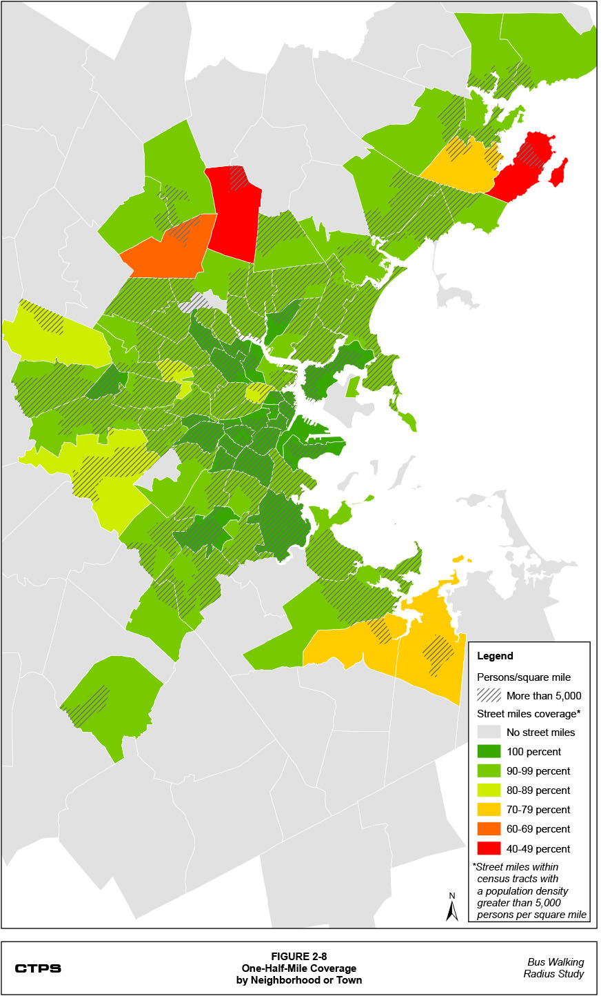
Table 2-3 presents the percentage of neighborhoods by the percentage of street miles covered, for each threshold (walking radius), for neighborhoods that have census tracts with a population density greater than 5,000 persons per square mile. For instance, the percentage of neighborhoods with 100% coverage of their street miles increases from 2.4% with the existing one-quarter-mile coverage threshold to 29.8% with a one-half-mile coverage threshold. Figures 2-5, 2-6, 2-7, and 2-8 show the percentage (within ranges of 10%) into which each neighborhood falls for each of the coverage thresholds. Table A-1 (in the appendix) presents the percentage of street miles covered, for each threshold (walking radius), in each neighborhood that has at least one-half mile of streets within census tracts with a population density greater than 5,000 persons per square mile. As shown in the tables and figures, the percentages of covered street miles increase in virtually all neighborhoods when the coverage threshold is increased.
Table 2-3
Percentage of Neighborhoods by Percentage
of Street Miles Covered, by Threshold (Walking Radius)
Percentage of Street Miles Covered* |
Percentage of Neighborhoods by Threshold |
|||
|---|---|---|---|---|
0.25-Mile |
0.33-Mile |
0.40-Mile |
0.50-Mile |
|
100% |
2.4% |
14.3% |
17.9% |
29.8% |
90-99% |
27.4% |
38.1% |
51.2% |
58.3% |
80-89% |
25.0% |
23.8% |
17.9% |
4.8% |
70-79% |
17.9% |
13.1% |
7.1% |
3.6% |
60-69% |
10.7% |
4.8% |
2.4% |
1.2% |
50-59% |
10.7% |
2.4% |
1.2% |
0.0% |
40-49% |
2.4% |
1.2% |
1.2% |
2.4% |
30-39% |
1.2% |
1.2% |
1.2% |
0.0% |
20-29% |
2.4% |
1.2% |
0.0% |
0.0% |
* Neighborhoods that have less than one-half mile of streets within census tracts with a population density greater than 5,000 persons per square mile are excluded. |
||||
Figure 2-1: One-Quarter-Mile Coverage by Street
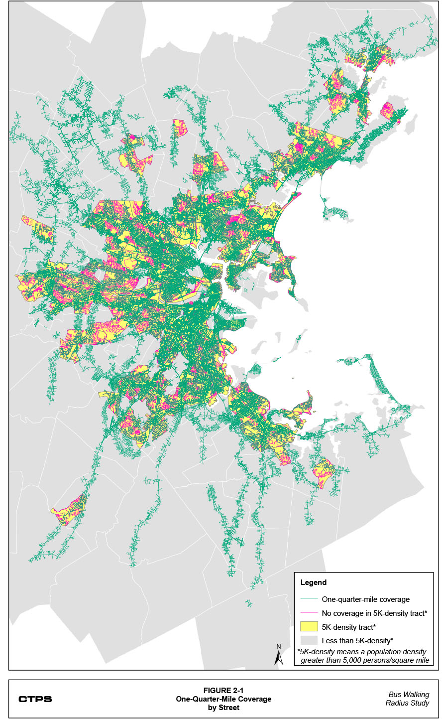
Figure 2-2: One-Third-Mile Coverage by Street

Figure 2-3: Four-Tenths-Mile Coverage by Street

Figure 2-4: One-Half-Mile Coverage by Street
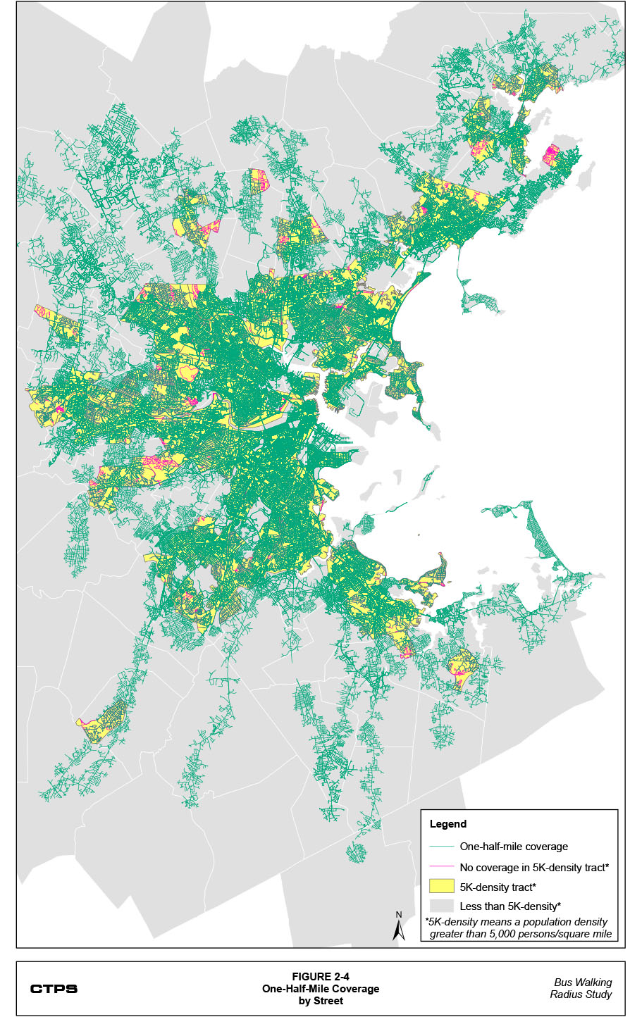
Figure 2-5: One-Quarter-Mile Coverage by Neighborhood or Town
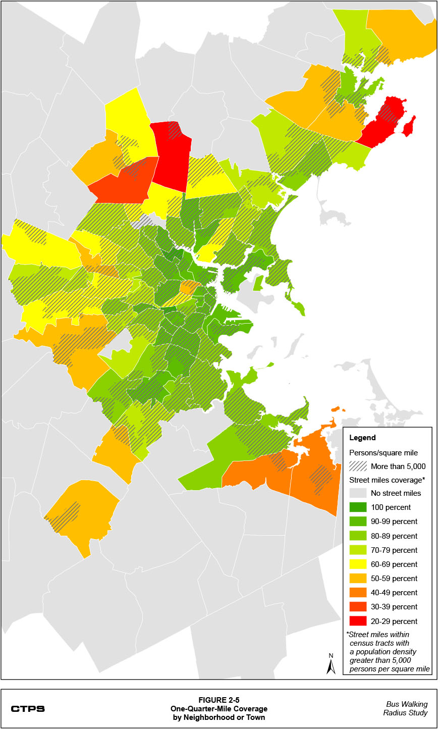
Figure 2-6: One-Third-Mile Coverage by Neighborhood or Town
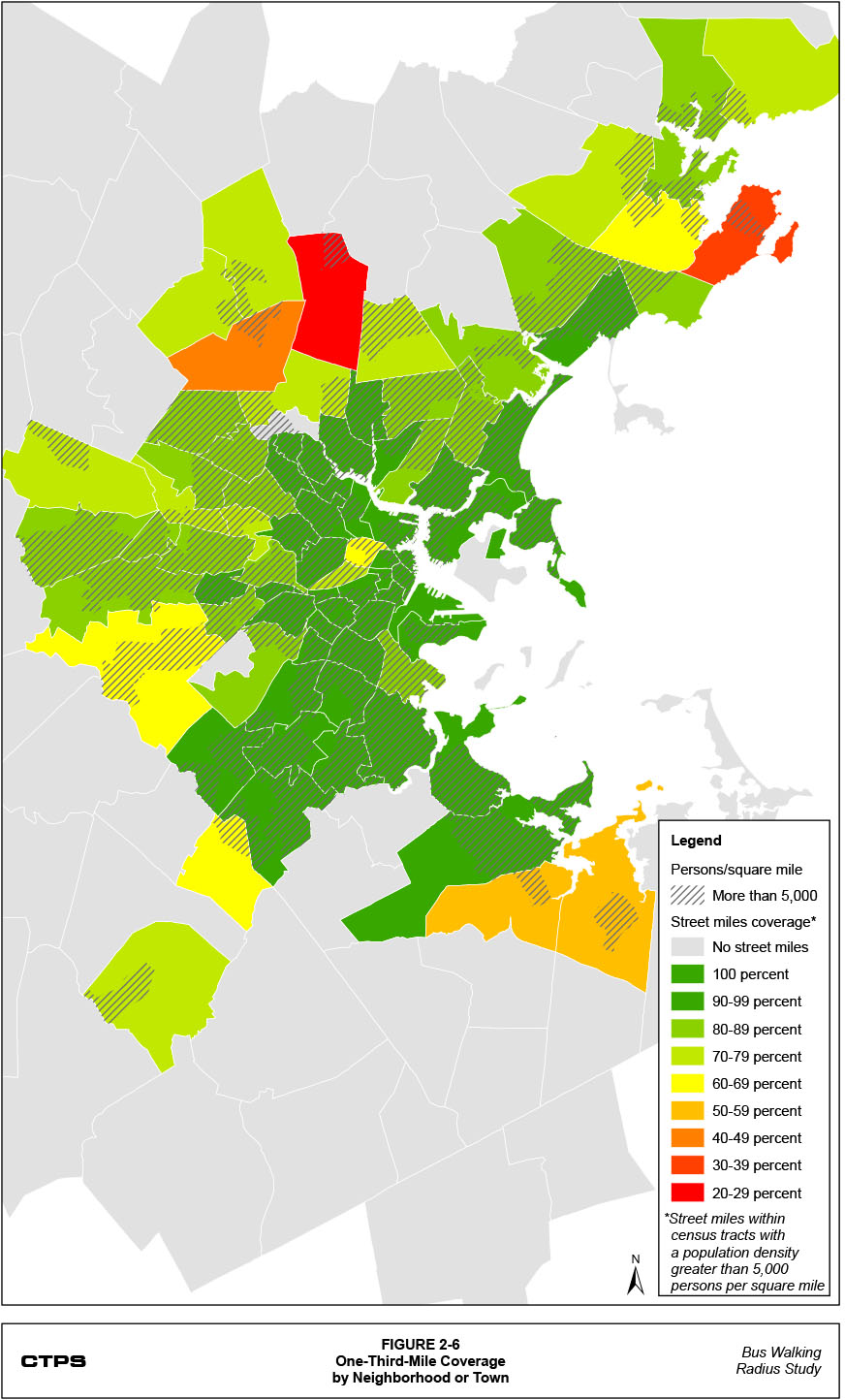
Figure 2-7: Four-Tenths-Mile Coverage by Neighborhood or Town
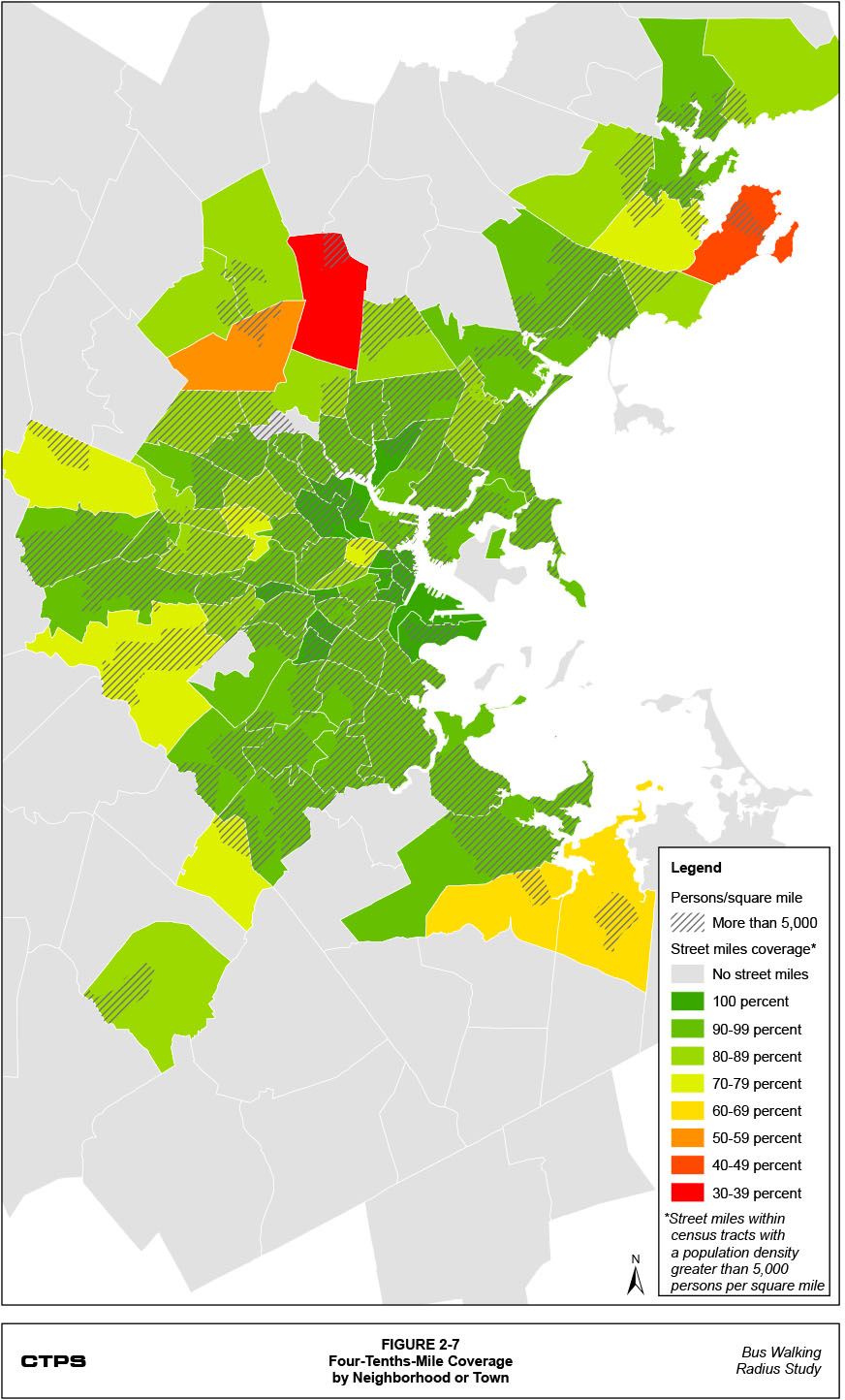
Figure 2-8: One-Half-Mile Coverage by Neighborhood or Town
Neighborhoods in Boston and Somerville generally have the greatest coverage percentages, while suburban neighborhoods have the lowest coverage percentages. The Winter Hill neighborhood in Somerville and the Boston University (BU) neighborhood in Boston are the only two neighborhoods at the one-quarter-mile coverage threshold with 100% coverage, though many other neighborhoods—indeed, the greatest percentage of neighborhoods for each coverage threshold—have coverage percentages of at least 90%. Although most towns and neighborhoods with lower coverage percentages are suburban, there are certain neighborhoods in the urban core that have lower coverage percentages than their surrounding neighborhoods. Across the various thresholds, the urban neighborhoods with the lowest coverage percentages are East Cambridge, Fresh Pond, Kendall/MIT, and East Everett.
An analysis of each MBTA route at each coverage threshold was conducted to determine the percentage of each route’s street miles that are in census tracts with a population density greater than 5,000 persons per square mile to determine which routes provide the greatest coverage in the areas analyzed under the coverage threshold. Table A-2 (in the appendix) presents these figures. As would be expected, routes serving more urban areas, where census tracts with greater population densities are primarily located, have greater percentages of their street miles serving these census tracts. Routes serving suburban locations, where there are fewer census tracts that have a population density of more than 5,000 people per square mile, have lower percentages of their street miles serving these census tracts.
It is also possible to compare each transit route’s total street miles at each coverage threshold to see how many of those miles are unique to a particular route or are overlapped by one or several other routes. This analysis showed that the routes with the greatest overall overlap percentages (correspondingly, the smallest unique percentages) are primarily located in the urban core, where their coverages overlap with other urban bus routes. Several routes, such as the SL4 and SL5 and Routes 116 and 117, have large overlap percentages because much of their routing is shared. Other routes, such as Routes 8 and 10, have smaller overlap percentages with one single route, while still having low overall unique percentages, because they are crosstown routes that cross several other routes.
The routes with the greatest unique percentages (correspondingly, the smallest overall overlap percentages) all serve more suburban locations. These routes are often the only transit service in these areas. As a result, these routes have small overlap percentages with other routes. Tables A-3 through A-6 (in the appendix) present, for every MBTA bus, light rail, and heavy rail route and for each coverage threshold, the unique coverage percentage (that is, the coverage does not overlap with those of any other routes) and overlap percentages of the 10 routes with the greatest overlap percentages (that is, the coverage does overlap with another route).
|
3 Service Plan Proposals |
|---|
This chapter describes a methodology for developing a service plan for the MBTA that is largely based on the overlap percentages and the unique percentages presented in Table A-3 (in the appendix). It then presents a summary of the proposed service plans for each of the three coverage thresholds (one-third mile, four-tenths mile, and one-half mile). Finally, this chapter describes how each proposed service plan would change the systemwide coverage percentage and the route-level overlap and unique percentages.
The methodology used to develop revised MBTA service plans for the bus, light rail, and heavy rail systems is primarily based on the percentages determined in the coverage analysis presented in the previous chapter.3 These percentages indicate the percentage of each transit route’s street miles at various coverage thresholds that are unique to that route or overlap with the coverages of other routes. Routes with low unique percentages and high overlap percentages, particularly those with high overlap percentages with one other route, were considered for elimination. No route was automatically eliminated because of a low unique percentage or high overlap percentage. For example, crosstown routes, even though they typically have low unique percentages, overlap with many different routes (as indicated by lower overlap percentages); it may not be advisable to eliminate this type of route because these routes provide a unique service that cannot be replaced by the overlapping routes. A limited-stop route is another example of a route that would likely be flagged for having a high overlap percentage but may not necessarily be recommended for elimination because it serves a particular service objective.
Therefore, although low unique percentages and high overlap percentages were used to highlight certain routes, the actual recommendations for service eliminations were based not only on these percentages but also on certain objectives related to providing a well-functioning service plan. These objectives included maintaining the following:
In addition, the selection of one route for elimination affects the overlap percentages of all other routes with overlapping coverages. Therefore, the selection of routes for elimination was done in an iterative fashion: first one route was selected; next, the resulting impact on other routes’ overlap percentages was assessed; then, based on this assessment, a second route was selected for elimination, and the iterative process began again. Using this methodology, there were times when the elimination of one particular route led to a series of eliminations that was ultimately determined to be undesirable. In these cases, the methodology required returning to the original elimination and recommencing the iterative process.
Finally, the systemwide coverage percentage was assessed for the current system before the effects of any eliminations or modifications were analyzed by applying the existing one-quarter-mile coverage threshold as well as the three greater coverage thresholds. Applying the one-quarter-mile coverage threshold, the existing coverage percentage was estimated at 79.5 percent. With no changes to the service plan, applying the one-third-mile coverage threshold, the existing coverage percentage would increase to 88.3 percent; applying the four-tenths-mile coverage threshold, the existing coverage percentage would increase to 92.7 percent; and applying the one-half-mile coverage threshold, the existing coverage percentage would increase to 96.2 percent. Another objective of the proposed service plans was to reduce these coverage percentages (through eliminations and route modifications) to be closer to the existing one-quarter-mile coverage percentage.
As the coverage thresholds increased from one-third mile to four-tenths-mile to one-half mile, it became more difficult to adhere to each of these objectives. Given the greater coverages resulting from increasing the coverage thresholds, it became increasingly difficult to eliminate or change services in order to approach the existing coverage percentage without drastically affecting overall service quality. As a result, particularly with the one-half-mile coverage threshold, service quality would be sacrificed to some extent because certain crosstown routes and some routes that provide the only service to certain areas would be eliminated.
While this methodology was primarily concerned with eliminating and modifying routes because of their overlapping coverages, the decision to eliminate or modify certain routes was also influenced by this study’s directive to reinvest the service hours of all eliminated service into the remaining system. Therefore, some routes were proposed for elimination under the assumption that nearby remaining routes would receive an increase in frequency. While the service plans for each coverage threshold would reduce the number of routes, this is balanced by the corresponding increase in frequencies for remaining routes.
The potential reinvestment of service hours was performed by assigning each transit route to a particular corridor based on the service characteristics of that route. These corridors (shown in Table 3-1) were determined as part of the Bus Deployment Needs Study, which grouped routes according to both their geographic coverage areas and whether they provided express or local service. When total service hours for each route were calculated using automatic vehicle location (AVL) schedule data for February 2011, 75% of the service hours associated with eliminated routes were reinvested into remaining routes in the same corridor. The other 25% of eliminated service hours were reinvested across the entire remaining system, with the amount weighted in proportion to each route’s existing service hours. Therefore, remaining routes with more existing service hours received a proportionally greater share of the reinvested service hours. The same distribution methodology was used for the remaining routes in the corridor of an eliminated route where 75% of the eliminated service hours were reinvested.
Generally, the service plan associated with the one-third-mile coverage threshold targeted for elimination routes with less than 10% of their coverages as unique to the route and greater than 60% of their coverages as overlapping with another route. With the four-tenths-mile coverage threshold, the unique percentage used to target routes for elimination increased to 25% and the overlap percentage decreased to 50 percent. This resulted in some crosstown routes being targeted for elimination. With the one-half-mile coverage threshold, the unique percentage for several eliminated routes was over 50% and the coverage percentage used to target routes for elimination fell, in several cases, below 50 percent. This reflects the fact that, applying the one-half-mile coverage threshold, the objective of avoiding the elimination of an area’s only service was sometimes ignored. Each of the service plans also generally targeted routes with higher net-cost-per-passenger figures. Table 3-1 presents the number of existing routes in each corridor grouping and, for each service plan, the number of routes that were recommended for elimination.
Table 3-1
Route Eliminations by Corridor by Coverage Threshold
Corridor (Existing Routes) |
0.33-Mile |
0.40-Mile Radius |
0.50-Mile Radius |
|---|---|---|---|
Downtown Locals (8) |
3 |
4 |
5 |
Kenmore Feeders (3) |
1 |
1 |
2 |
South Boston Locals (8) |
2 |
2 |
3 |
North Shore Routes (15)* |
9 |
10 |
11 |
Circumferential Locals (23) |
7 |
9 |
11 |
Dorchester Red Line Feeders (9) |
4 |
6 |
7 |
Cambridge Red Line Feeders (21) |
7 |
8 |
10 |
Suburban Circumferentials (2) |
0 |
0 |
2 |
Orange Line North Feeders (18) |
8 |
11 |
11 |
Lynn Locals (5) |
3 |
3 |
4 |
Blue Line Locals (8) |
2 |
2 |
3 |
Lechmere Feeders (4) |
0 |
0 |
1 |
Southwest Corridor Feeders (19) |
10 |
10 |
10 |
I-93 Express Routes (6) |
5 |
5 |
6 |
Orange Line North Suburban (5) |
0 |
1 |
4 |
Turnpike Express Routes (11) |
9 |
9 |
10 |
South Shore Routes (24) |
5 |
6 |
15 |
Suburban Local (13) |
1 |
1 |
5 |
Early Morning Routes (5) |
0 |
0 |
0 |
* Since all Salem Local Routes were eliminated in each service plan, they were re-coded as North Shore Routes. |
|||
As the coverage threshold increases, a greater number of street miles fall into each route’s coverage area. Even with the proposed eliminations, if the increase in the coverage threshold is of sufficient distance, the net systemwide coverage percentage also increases. This explains the increase in the systemwide coverage percentage from the one-quarter-mile coverage threshold (79.5%) to the one-third-mile coverage threshold (84.0%), and from the one-third-mile coverage threshold to the four-tenths-mile coverage threshold (87.8%). However, by eliminating several suburban routes that provide the only service to certain areas in the one-half-mile coverage threshold, the total number of covered street miles actually falls from the four-tenths-mile coverage threshold to the one-half-mile coverage threshold (85.3%).
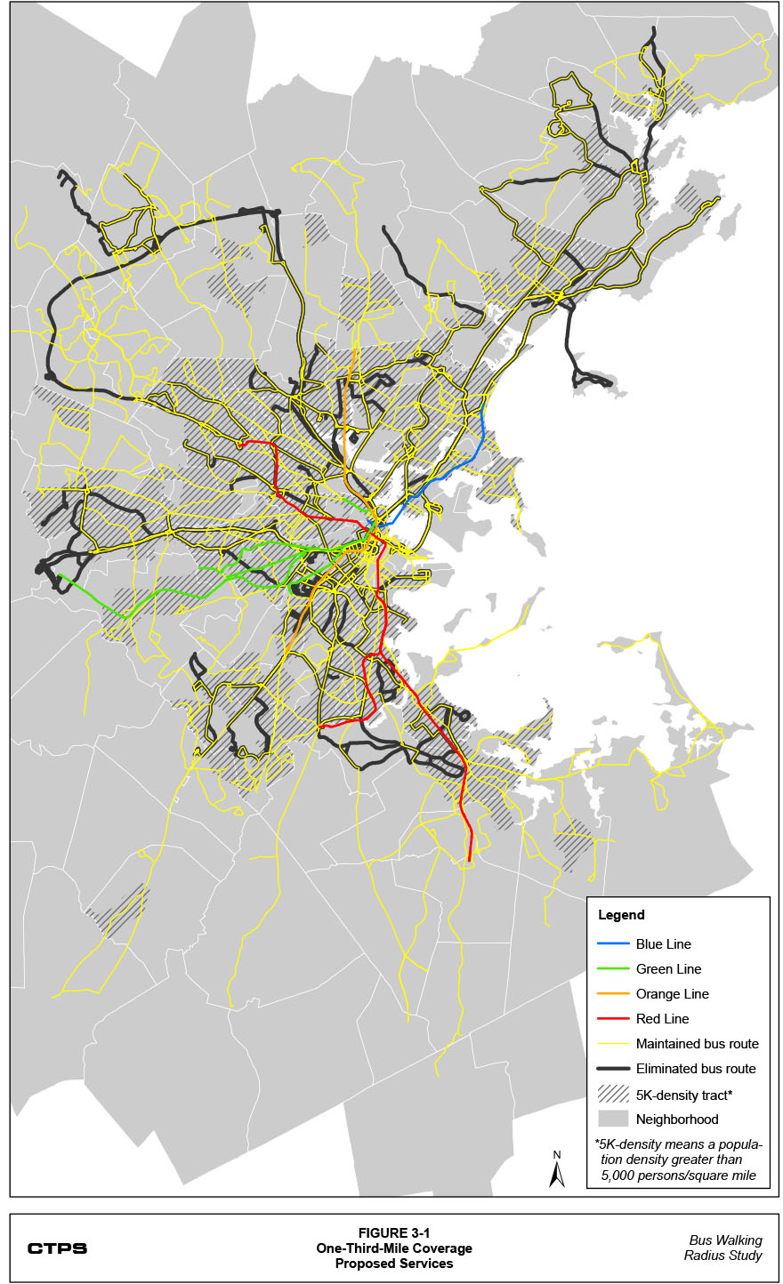
Figures 2-9, 2-10, and 2-11 show the geographic extent of the proposed route eliminations for the service plans under each coverage threshold. As shown in the figures, compared to the one-third mile coverage threshold, the number of unique route miles targeted for elimination increases slightly when applying the four-tenths-mile coverage threshold and dramatically when applying the one-half-mile coverage threshold. In all three service plans, route eliminations are distributed across the entire service area. However, most of the route eliminations in the urban core overlap or are near maintained routes, while many of the route eliminations outside the urban core have unique route miles in those areas. Under both the one-third-mile and four-tenths-mile coverage thresholds, most of the route eliminations are in the urban core. It is apparent from the figures that the route eliminations with the one-half-mile coverage threshold in the suburbs result in the elimination of many more unique route miles.
Table A-7 (in the appendix) presents, for every MBTA bus, light rail, and heavy rail route, the service plan proposal for each route under each coverage threshold. Tables A-8 through A-10 present, for each of the remaining routes for each coverage threshold, the recalculated unique percentages and overlap percentages of the 10 routes that have the greatest overlap percentages.
As mentioned in the discussion of the methodology, the proposed three service plans, each using a different coverage threshold, were intended to be revenue neutral, meaning that whatever service hours were proposed for elimination should be reinvested into the remaining routes in each service plan. Routes were grouped into several corridors, and 75% of the service hours from any eliminated route were reinvested into that route’s same corridor, with the remaining 25% distributed across the entire remaining system. Service hours were distributed to individual routes based on their existing relative total of service hours; that is, routes with greater existing service-hour totals received relatively more of the redistributed service hours. The redistribution of service hours was separated into four separate time periods (morning [AM], midday [MD], evening [PM], and night [NT]), based on the time period definitions used in the regional travel demand model set.
Table 3-2 presents the total number of service hours that were eliminated in the service plans for each coverage threshold and then reinvested into the remaining routes. The one-third-mile coverage threshold resulted in a service plan that eliminated and reinvested 21.8% of the existing number of service hours; this figure was 25.7% for the four-tenths-mile coverage threshold. As the table shows, the amount of elimination and reinvestment is clearly the greatest when applying the one-half-mile coverage threshold. These service hours make up 37.6% of the existing number of service hours.
Table 3-2
Eliminated Service Hours by Time Period by Coverage Threshold
Time Period |
0.33-Mile Radius |
0.40-Mile Radius |
0.50-Mile Radius |
|---|---|---|---|
Morning (AM) |
378 |
444 |
640 |
Midday (MD) |
403 |
475 |
705 |
Evening (PM) |
371 |
436 |
618 |
Night (NT) |
254 |
298 |
454 |
All Day |
1,405 |
1,654 |
2,417 |
Table 3-3 summarizes, for each coverage threshold, the percentage decrease in headway for each corridor grouping across the entire day resulting from the reinvestment of service hours from eliminated routes in that corridor and across the entire system. As shown in the table, the elimination of some routes in each corridor permits some significant improvements in headway. Tables A-11 through A-13 (in the appendix) present the existing and proposed average headways and the resulting percentage improvement for each route by time period for each coverage threshold. Some examples of the routes that have significant improvements in headway are:
Figure 3-1: One-Third-Mile Coverage Proposed Services
Figure 3-2: Four-Tenths-Mile Coverage Proposed Services
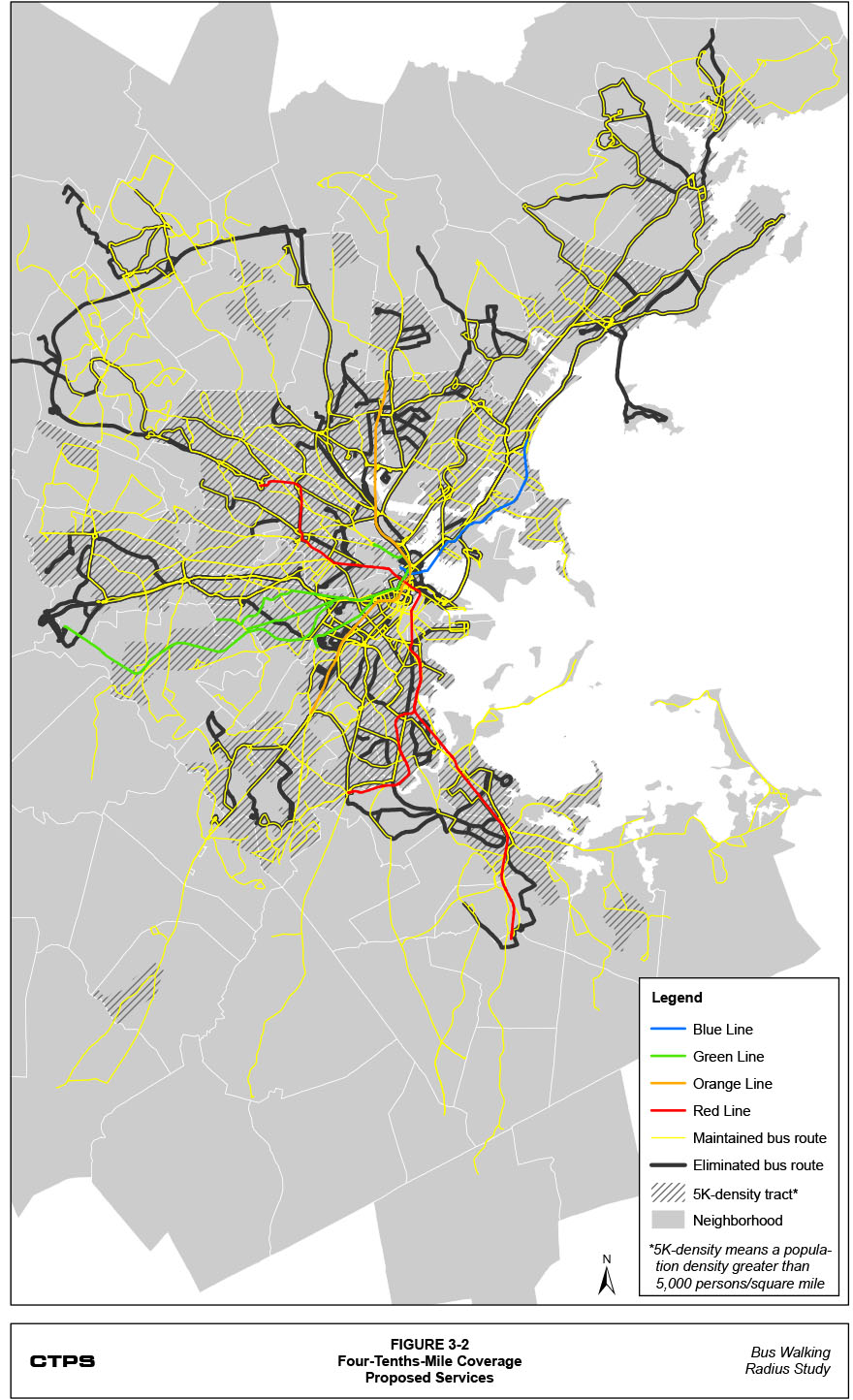
Figure 3-3: One-Half-Mile Coverage Proposed Services
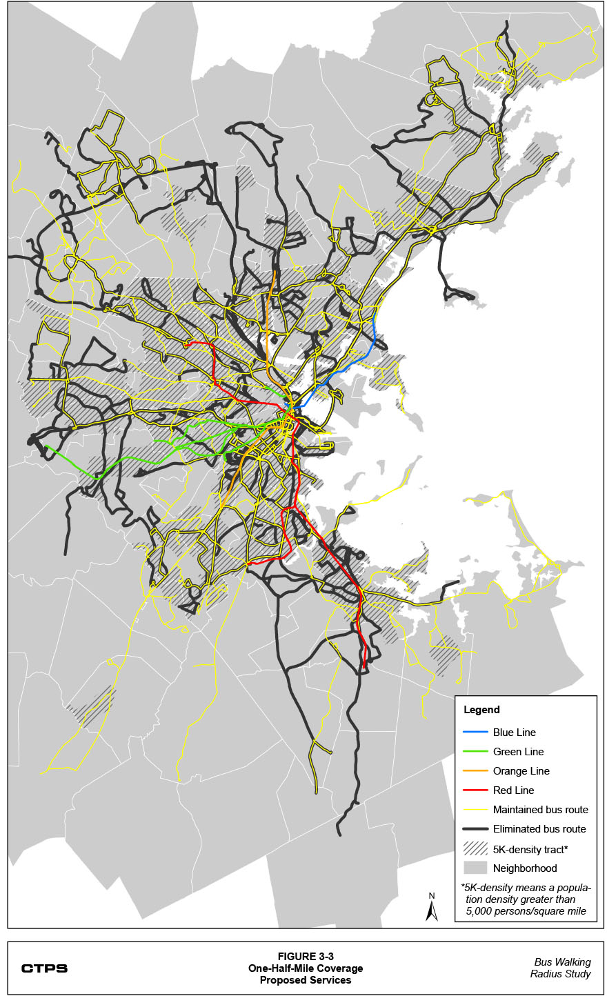
Table 3-3
Average All-Day Percentage Headway Improvement
by Corridor by Coverage Threshold
Corridor |
0.33-Mile Radius |
0.40-Mile Radius |
0.50-Mile Radius |
|---|---|---|---|
Downtown Locals |
-26.9% |
-36.5% |
-40.1% |
Kenmore Feeders |
-17.5% |
-18.6% |
-34.4% |
South Boston Locals |
-16.3% |
-17.5% |
-27.6% |
North Shore Routes |
-26.9% |
-29.2% |
-42.3% |
Circumferential Locals |
-12.5% |
-15.7% |
-23.0% |
Dorchester Red Line Feeders |
-23.1% |
-34.7% |
-43.4% |
Cambridge Red Line Feeders |
-16.3% |
-19.6% |
-27.4% |
Suburban Circumferentials |
-5.9% |
-7.4% |
N/A* |
Orange Line North Feeders |
-24.0% |
-39.9% |
-42.0% |
Lynn Locals |
-17.2% |
-18.1% |
-37.7% |
Blue Line Locals |
-10.2% |
-11.5% |
-23.8% |
Lechmere Feeders |
-6.3% |
-7.7% |
-31.3% |
Southwest Corridor Feeders |
-36.7% |
-37.4% |
-40.4% |
I-93 Express Routes |
-50.5% |
-50.9% |
N/A* |
Orange Line North Suburban |
-6.1% |
-14.7% |
-64.8% |
Turnpike Express Routes |
-60.8% |
-60.9% |
-71.9% |
South Shore Routes |
-10.5% |
-13.9% |
-43.0% |
* All Suburban Circumferentials and I-93 Express routes are recommended for elimination using the one-half-mile coverage threshold, which is why no percentage changes are listed for these corridors. Note: Suburban local routes were not included in the service-hour reinvestment because their operations are outside the purview of the MBTA. Early-morning routes were not included in the service-hour reinvestment because they serve a different market at a different time period than other routes. In addition, no routes in this corridor were recommended for elimination. |
|||
As would be expected, routes with longer existing headways received a greater absolute decrease in headways for a given percentage increase. However, a decrease of around one minute for high-frequency routes such as Route 1 (for which the headway decreased from 9.1 minutes to 7.8 minutes, a percentage decrease of 14.6 percent, with the one-quarter-mile coverage threshold in the AM time period) would also provide a significant improvement in the service level.
In summary, the service plans based on the one-third-mile, four-tenths-mile, and one-half mile coverage thresholds each provide a different balance. If the one-quarter-mile coverage threshold is understood to represent the existing balance of service frequency with service coverage, the three other coverage thresholds propose devoting a progressively greater share of resources to a smaller number of transit routes in order to increase their frequencies. These proposals are further enabled by assuming that transit riders would be willing to walk greater distances to access transit routes, particularly routes with greater frequencies. The next chapter uses the regional model set to project how transit ridership would actually respond to each of the three service plans.
|
4 Estimate of Impacts |
|---|
This chapter analyzes several impacts of the three service plans presented in the previous chapter, each based on a different coverage threshold. The regional travel demand model set was used to perform this analysis. The methodology essentially models each trip individually based on various matrices of modeled costs for different modes and travel pathways; the model set includes calculations of the least “costly” mode and path between each trip’s origin and destination. These “costs” include, for the personal automobile mode, the price of gasoline, parking, and tolls. For the transit mode, “costs” include the time needed to walk from the trip origin to transit (the access time), the waiting time, the transit fare, the in-vehicle travel time, the number of transfers, the transfer waiting time, and the time needed to walk from transit to the trip destination (the egress time). Since each of these trip calculations is calculated separately in the regional model set, it is possible to present the model results at the system level and for various route, cost, and geographic categories.
This chapter will therefore include several different levels of summaries of the projected impacts of each proposed service plan. First, it will summarize the projected ridership impacts by mode. Second, it will summarize the impacts on bus riders in terms of the various transit costs. Third, it will consider how these impacts are distributed across different transit routes. Fourth, the chapter will highlight any significant changes in ridership patterns by neighborhood. Fifth, it will summarize the impacts on riders in terms of ridership and the various transit costs by the regional equity classifications of different areas. Finally, the chapter will present estimates from the regional model set of the air quality impacts of each service plan.
Table 4-1 presents estimates, produced using the regional model set, of the ridership impacts of each of the three service plans that were based on the one-third-mile, four-tenths-mile, and one-half-mile coverage thresholds. It appears that there is very little difference between the amount of change associated with the one-third-mile and the one-half-mile coverage threshold. This includes significant decreases in bus ridership, smaller decreases in heavy rail ridership, and increases in light rail and commuter rail ridership. For the bus, heavy rail, and commuter rail modes, the amount of these changes is much larger for the one-half-mile coverage threshold than for the one-third-mile coverage threshold. The ridership impacts of the four-tenths-mile coverage threshold appear to follow a slightly different pattern. Bus ridership hardly changes, heavy rail and commuter rail ridership decrease, and light rail ridership increases. Finally, the systemwide ridership total is projected to decrease for all three coverage thresholds, but the four-tenths-mile coverage threshold is projected to result in the smallest decrease.
The changes in private-vehicle (drive-alone and high-occupancy-vehicle) trips for both the one-third-mile and four-tenths-mile coverage thresholds are small, though the change is positive for the former and negative for the latter. The one-half-mile coverage threshold, in comparison, results in a much greater increase in private-vehicle trips. Walk trips are also projected to increase for all three coverage thresholds, and the one-third-mile coverage threshold is projected to result in the greatest increase.
Several conclusions can be drawn from the projections presented in Table 4-1. With regard to the bus mode, it appears that the service plan associated with the four-tenths-mile coverage threshold attains the appropriate balance, according to the regional model set, between the elimination of route miles and the reinvestment of those routes’ service hours into remaining routes in order to improve their frequency, resulting in a negligible net ridership change. Neither the one-third-mile nor one-half-mile coverage thresholds appear to achieve this balance. The frequency improvements using the one-third-mile coverage threshold are not significant enough to attract the number of new riders required to replace the riders lost because of the route eliminations. As a result, the net bus ridership change is a loss of more than 10,000 daily trips. The one-half-mile coverage threshold likely tips the balance too far in the opposite direction, eliminating so many routes that even the new riders that are attracted to the service because of the much improved frequencies are not enough to replace the riders lost due to the route eliminations.
Table 4-1
Estimates of Daily Trip Impacts by Mode by Coverage Threshold
Mode |
Change |
0.33-Mile Radius |
0.40-Mile Radius |
0.50-Mile Radius |
|---|---|---|---|---|
Bus |
Absolute change |
-10,483 |
-81 |
-19,609 |
Bus |
Percentage change |
-2.6% |
-0.02% |
-4.8% |
Heavy rail |
Absolute change |
-1,892 |
-3,726 |
-4,375 |
Heavy rail |
Percentage change |
-0.4% |
-0.8% |
-1.0% |
Light rail |
Absolute change |
+4,861 |
+2,145 |
+4,609 |
Light rail |
Percentage change |
+1.7% |
+0.8% |
+1.6% |
Commuter rail |
Absolute change |
+717 |
-543 |
+4,870 |
Commuter rail |
Percentage change |
+0.7% |
-0.6% |
+5.0% |
Systemwide transit |
Absolute change |
-6,977 |
-2,205 |
-14,505 |
Systemwide transit |
Percentage change |
-0.6% |
-0.2% |
-1.2% |
Private vehicle |
Absolute change |
+1,096 |
-1,610 |
+12,631 |
Private vehicle |
Percentage change |
+0.01% |
-0.01% |
+0.11% |
Walk |
Absolute change |
+2,231 |
+760 |
+646 |
Walk |
Percentage change |
+0.09% |
+0.03% |
+0.03% |
These varying impacts between coverage thresholds on the bus mode are also the likely causes of differences between the thresholds in terms of the impacts on other modal ridership categories. For the one-third-mile coverage threshold, the increases in light rail and commuter rail trips are likely caused by the shifting of former bus riders whose routes have been eliminated, while the decrease in heavy rail trips is the likely result of fewer bus riders and fewer transfers to heavy rail stations. The changes resulting from the one-half-mile coverage threshold are similar to those of the one-third-mile coverage threshold. The increases in light rail and commuter rail trips are likely caused by the elimination of bus routes. However, the much greater commuter rail increase resulting from applying the one-half-mile coverage threshold
reflects the larger number of suburban routes that are eliminated in the service plan associated with the one-half-mile coverage threshold. Many of the riders on these routes are likely switching to commuter rail. Furthermore, the decrease in heavy rail trips is more than twice that of the one-third-mile coverage threshold. With even fewer bus routes, there are fewer transfer opportunities to rapid transit. In addition, the headways on many bus routes using the one-half-mile coverage threshold would be much more competitive with the rapid transit system, likely attracting some heavy rail riders to the bus mode because of its lower fare.
With the four-tenths-mile coverage threshold, it is apparent that some riders are switching from buses to light rail, though a smaller number than with the other two coverage thresholds. Heavy rail and commuter rail trips decrease with this coverage threshold, likely because of two factors. First, fewer bus routes are serving rail stations, and this reduces the number of transfers to heavy rail and commuter rail stations. Second, the improved frequencies of the remaining bus routes would attract some heavy rail and commuter rail riders.
In terms of the number of people switching to a different travel mode, all three coverage thresholds are projected to increase the number of daily walk trips. This makes sense, as some passengers would replace short-distance transit trips with walk trips. The greatest switch from transit to private-vehicle trips likely occurs with the one-half-mile coverage threshold. The increase in private-vehicle trips with this coverage threshold nearly equals the decrease in systemwide transit trips and likely reflects the decision by some riders to stop using transit altogether because of the route eliminations. Neither the one-third-mile nor the four-tenths-mile coverage thresholds appear to result in much switching from transit to private-vehicle trips. Indeed, the small decrease in private-vehicle trips for the four-tenths-mile coverage threshold indicates that the improved frequencies of the remaining bus routes would attract some current drivers to transit.
As mentioned in the introduction to this chapter, trips are estimated in the regional travel demand model set based on various matrices of modeled costs for pathways of travel. For the transit mode, these costs include the time needed to walk from the trip origin to transit (the access time), the waiting time, the transit fare, the in-vehicle travel time, the number of transfers, the transfer waiting time, and the time needed to
walk from transit to the trip destination (the egress time). Table 4-2 summarizes the absolute and percentage changes in these average transit costs.
Table 4-2
Change in Transit Cost Metrics by Coverage Threshold
|
0.33-Mile Radius |
0.40-Mile Radius |
0.50-Mile Radius |
|||
|---|---|---|---|---|---|---|
Transit Cost Metric |
Abs. |
Per. |
Abs. |
Per. |
Abs. |
Per. |
Average fare |
<-$0.01 |
-0.3% |
<-$0.01 |
-0.4% |
<+$0.01 |
+0.5% |
In-vehicle travel time (min.) |
+0.01 |
+0.1% |
<+0.01 |
<+0.1% |
-0.14 |
-0.8% |
Number of transfers |
<-0.01 |
-0.4% |
<+0.01 |
+0.7% |
<+0.01 |
+1.5% |
Total waiting time (min.) |
-0.10 |
-1.5% |
-0.15 |
-2.3% |
-0.30 |
-4.6% |
Access + egress walk time (min.) |
+0.14 |
+1.0% |
+0.02 |
+0.1% |
+0.12 |
+0.8% |
As shown in the table, the modeled changes in transit costs are negligible for average fare, in-vehicle travel time, and the number of transfers. This is not unexpected for the average fare and in-vehicle travel time, given that the changes proposed in each service plan do not directly affect these two costs, although the switching of riders between modes could indirectly change these systemwide average values based on the revised distribution of transit trips between different modes. It is somewhat surprising that the average number of transfers does not have a greater increase, given that there are fewer routes in each service plan. However, the service plan for the one-half-mile coverage threshold, which has the lowest number of routes, has the largest percentage change in transfers.
The progressively larger decreases in total waiting time from the one-third-mile to the one-half-mile coverage threshold reflect the greater frequencies associated with each service plan. It is somewhat surprising that the one-third-mile coverage threshold would have the greatest increase in walk time, since the other two coverage thresholds eliminate a greater number of routes. However, the lower increases for the four-tenths-mile and one-half-mile coverage thresholds may reflect the fact that, because fewer riders are willing to walk longer distances to or from these routes, a greater percentage of remaining and new riders would have origins and destinations nearby their route. This would reduce the average walk time.
The regional model set was used to project the change in ridership for each bus route in each of the three service plans. These projections are presented in the appendix in Table A-14. Table 4-3 groups the routes into the corridors presented in the previous chapter and shows the average of their projected percentage changes in ridership, weighted by existing trips. The differences between coverage thresholds become even more apparent when looking at the ridership impacts. The direction of the impacts (positive or negative) for each corridor is generally consistent between the coverage thresholds. However, for the service plan associated with the four-tenths-mile coverage threshold, the decreases in projected ridership for several corridors are less than those associated with the one-third-mile coverage threshold, and the projected increases in ridership for several corridors are greater than those associated with the one-half-mile coverage threshold. For instance, the service plan associated with the four-tenths-mile coverage threshold has the greatest percentage increase in ridership in the Downtown Locals corridor and the smallest percent decrease in ridership in the North Shore Routes corridor.
Table 4-3
Percentage Change in Average Daily Trips
by Corridor by Coverage Threshold
Corridor |
0.33-Mile Radius |
0.40-Mile Radius |
0.50-Mile Radius |
|---|---|---|---|
Downtown Locals |
+26.2% |
+44.7% |
+40.6% |
Kenmore Feeders |
+2.0% |
+6.4% |
+12.9% |
South Boston Locals |
+2.1% |
+3.1% |
+4.2% |
North Shore Routes |
-15.0% |
-8.2% |
-21.0% |
Circumferential Locals |
-2.6% |
+3.6% |
+6.7% |
Dorchester Red Line Feeders |
-13.0% |
-19.9% |
-22.6% |
Cambridge Red Line Feeders |
+5.0% |
+4.4% |
+6.4% |
Suburban Circumferentials |
+6.7% |
+8.1% |
N/A |
Orange Line North Feeders |
-5.0% |
-8.2% |
-9.3% |
Lynn Locals |
+1.9% |
+6.8% |
-4.9% |
Blue Line Locals |
-7.9% |
-5.1% |
-9.9% |
Lechmere Feeders |
+7.7% |
+7.1% |
+3.3% |
Southwest Corridor Feeders |
-6.6% |
-1.6% |
-6.1% |
I-93 Express Routes |
-2.6% |
+12.6% |
N/A |
Orange Line North Suburban |
+3.6% |
+4.0% |
-73.6% |
Turnpike Express Routes |
-28.2% |
-24.7% |
-48.8% |
South Shore Routes |
-1.0% |
-0.5% |
-5.7% |
As hypothesized in the previous section, it appears that the service plan associated with the four-tenths-mile coverage threshold attains the best balance between reduced coverage and better service levels. Undoubtedly, the overall bus mode loses more riders than it gains, and there are some corridors that have much greater ridership losses than others. However, overall, the four-tenths-mile coverage threshold does a better job than the one-third-mile and one-half-mile coverage thresholds at attracting new riders to the mode to replace those lost because of route eliminations.
The geographic model area of the regional travel demand model set is organized by transportation analysis zones (TAZs), which are grouped together to form recognizable neighborhood and town boundaries.4 For the purpose of this study, all groupings of TAZs, even those with the same boundaries as a town, are referred to as neighborhoods. Since the number of modeled trips is calculated by the regional model set at the TAZ level, these trips can be summed for all TAZs by neighborhood to obtain neighborhood totals.
Table 4-4 presents, for the service plans associated with each coverage threshold compared to the existing system, the neighborhoods with the 10 greatest and smallest estimated absolute changes in daily transit trips compared to the existing system. Table A-15 (in the appendix) presents the estimated absolute and percentage changes in daily transit trips for each service plan for each neighborhood where at least one of the service plans’ absolute changes exceeds 50 daily trips. These tables show several patterns between the three coverage threshold standards.
In terms of the greatest increases in daily transit trips, the 10 neighborhoods with the one-third-mile coverage threshold are mostly suburban neighborhoods. Ridership gains in these neighborhoods, where service eliminations were largely avoided using this threshold, are likely a result of the improved headways. The situation is similar when the four-tenths-mile coverage threshold is applied. However, it is apparent from the table that, while several of the same neighborhoods are listed under both the one-third-mile and four-tenths-mile coverage thresholds, the absolute increases for these neighborhoods are generally greater for the four-tenths-mile coverage threshold. It also seems that the four-tenths-mile coverage threshold is more successful at attracting trips to more-urban neighborhoods. Unlike these two coverage thresholds, the neighborhoods with the 10 greatest trip increases when applying the one-half-mile coverage threshold are mostly urban. These are neighborhoods that, under this service plan, maintain some level of service while receiving significant frequency improvements. However, as seen in the table, the sizes of these increases are much smaller for the one-half-mile coverage threshold than for the other two coverage thresholds.
Table 4-4
Top 10 Absolute Gains and Losses in Transit Trips
by Coverage Threshold
|
0.33-Mile Radius |
0.40-Mile Radius |
0.50-Mile Radius |
|||
|---|---|---|---|---|---|---|
|
Neighborhood |
Chg. |
Neighborhood |
Chg. |
Neighborhood |
Chg. |
Top 10 Gains |
|
|
|
|
|
|
1 |
East Woburn |
2,792 |
East Woburn |
2,995 |
South Quincy |
363 |
2 |
South Newton |
1,961 |
South Newton |
2,023 |
North Allston |
248 |
3 |
North Newton |
975 |
Stoneham |
1,052 |
South Allston |
212 |
4 |
Stoneham |
972 |
North Newton |
956 |
North Brookline |
184 |
5 |
West Everett |
935 |
Needham |
952 |
Harvard Sq. |
171 |
6 |
Needham |
928 |
West Woburn |
905 |
North Weymouth |
162 |
7 |
Melrose |
867 |
Winchester |
706 |
South Waltham |
141 |
8 |
West Woburn |
855 |
Melrose |
645 |
Hyde Park |
132 |
9 |
West Malden |
712 |
West Roxbury |
587 |
North Braintree |
103 |
10 |
East Malden |
674 |
Downtown |
580 |
East Watertown |
98 |
Top 10 Losses |
|
|
|
|
|
|
1 |
Longwood |
-1,033 |
South Quincy |
-445 |
Longwood |
-697 |
2 |
Fenway |
-919 |
North Weymouth |
-162 |
East Woburn |
-580 |
3 |
South Quincy |
-539 |
Hingham |
-110 |
East Lynn |
-570 |
4 |
South Roxbury |
-354 |
South Allston |
-95 |
South Newton |
-451 |
5 |
North Roxbury |
-327 |
South Danvers |
-85 |
Logan Airport |
-378 |
6 |
BU |
-317 |
South Weymouth |
-80 |
Needham |
-253 |
7 |
Harvard Sq. |
-270 |
North Braintree |
-70 |
Fenway |
-250 |
8 |
Logan Airport |
-254 |
Mattapan |
-67 |
Melrose |
-245 |
9 |
Chelsea |
-247 |
North Salem |
-54 |
East Malden |
-243 |
10 |
North Dorchester |
-221 |
Harvard Sq. |
-42 |
Marblehead |
-239 |
Using the one-third-mile coverage threshold, the 10 neighborhoods with the greatest decreases in daily transit trips are mostly urban neighborhoods; these are the neighborhoods where the service eliminations were largely concentrated. While the four-tenths-mile coverage threshold also includes eliminations in several urban neighborhoods, the list of the top 10 trip decreases using this service plan also includes several suburban neighborhoods. The one-half-mile coverage threshold also includes a mix of urban and suburban neighborhoods. However, as seen in the table, the sizes of the decreases are much smaller for the four-tenths-mile coverage threshold than the other two coverage thresholds.
These results seem to support the hypothesis presented in the previous sections that the service plan associated with the four-tenths-mile coverage threshold attains the best balance between reduced coverage and better service levels. Undoubtedly, when the analysis considers the impact of service eliminations on individual neighborhoods, there are winners and losers. For the one-third-mile coverage threshold, the winners are suburban neighborhoods and the losers are urban neighborhoods. The impacts of the four-tenths-mile and one-half-mile coverage thresholds are not as specific to urban or suburban neighborhoods. However, when considering the sizes of the gains and losses, it is apparent that the four-tenths-mile coverage threshold has the smallest impact of the three, both overall and on many individual neighborhoods.
To assess the equity of the impacts of the changes proposed in the three service plans (based on the three coverage thresholds) on minority or low-income communities, this study included an environmental justice (EJ) impacts analysis. Each TAZ was identified as “EJ” or “non-EJ” based on whether its average household income was at or below 60% of the median household income or its percentage of non-white population was greater than the average, for the MBTA’s service area.5 Any TAZ that qualifies as low-income and/or minority was considered an EJ community.
After identifying the EJ communities, the regional model set was used to calculate a “score” for each TAZ in terms of the various costs presented in section 4.2.6 Averages across TAZs (for EJ and non-EJ communities) were calculated and each TAZ’s score was weighted according to its existing transit trips. Table 4-5 presents a summary of the percentage changes in the EJ and non-EJ average scores for each of the transit costs for each of the coverage thresholds.
Table 4-5
Percentage Change in Transit Cost Equity Metrics
by Coverage Threshold
|
0.33-Mile Radius |
0.40-Mile Radius |
0.50-Mile Radius |
|||
|---|---|---|---|---|---|---|
Transit Cost Metric |
Non-EJ |
EJ |
Non-EJ |
EJ |
Non-EJ |
EJ |
Average fare |
-1.1% |
+0.1% |
-1.1% |
<0.1% |
+0.3% |
+0.8% |
In-vehicle travel time |
-0.1% |
+0.1% |
-0.3% |
+0.2% |
-1.8% |
-0.1% |
Number of transfers |
-0.2% |
-0.4% |
+0.4% |
+0.8% |
+0.4% |
+1.9% |
Total waiting time |
-1.7% |
-1.5% |
-2.5% |
-2.2% |
-5.6% |
-3.9% |
Access + egress walk time |
+0.1% |
+1.4% |
-0.7% |
+0.5% |
-0.1% |
+1.3% |
As shown in the table, according to the regional model set, the percentage changes in each cost metric slightly favor non-EJ communities over EJ communities. This difference is of particular concern when considering metrics that are directly related to the different service plans. For instance, greater percentage increases in the number of transfers for EJ communities with the four-tenths-mile and one-half-mile coverage threshold may indicate that the cuts in the urban core are too drastic. It is also interesting to note that non-EJ communities perform better than EJ communities for both the total waiting and walk times with all three coverage thresholds. However, the percentage changes between EJ and non-EJ communities are neither so far apart nor large enough that they would seem to indicate any systematic negative impact on EJ communities.
The air quality impacts of the three service plans based on the three coverage thresholds were analyzed using the regional model set’s estimate of regional traffic volumes, average highway speeds, and vehicle-miles and vehicle-hours traveled. Air pollutants produced by vehicles generally fall into two groups: gaseous and particulate. Examples of gaseous pollutants include carbon monoxide (CO), volatile organic compounds (VOC, also known as hydrocarbons), nitrogen oxides (NOx), and carbon dioxide (CO2). In addition, there are photochemical oxidants (such as ozone) that are not directly emitted from vehicles but are formed when VOC and NOx chemically react in the presence of sunlight and warm temperatures. Particulate pollutants produced by vehicles are commonly broken into two categories: fine particulates—those with a diameter of 2.5 micrometers or less; and coarse particulates—those with a diameter between 2.5 and 10 micrometers. Table 4-6 presents the estimated air quality impacts.
Table 4-6
Change in Selected Pollutants (Regionwide*)
by Coverage Threshold
|
0.33-Mile Radius |
0.40-Mile Radius |
0.50-Mile Radius |
|||
Pollutant |
Abs. |
Per. |
Abs. |
Per. |
Abs. |
Per. |
Carbon monoxide (kg) |
+91 |
<+0.01% |
-148 |
-0.01% |
+908 |
+0.06% |
Nitrogen oxides (kg) |
-2 |
>-0.01% |
+32 |
+0.02% |
-113 |
-0.07% |
Volatile organic compounds (kg) |
+2 |
<+0.01% |
-3 |
-0.01% |
+36 |
+0.08% |
Carbon dioxide (kg) |
+178 |
<+0.01% |
+6,774 |
+0.01% |
+7,443 |
+0.01% |
Fine particulates (kg) |
+0.4 |
+0.01% |
+0.2 |
<+0.01% |
+2.0 |
+0.05% |
Coarse particulates (kg) |
+0.6 |
+0.01% |
+0.4 |
<+0.01% |
-0.1 |
>-0.01% |
* “Regionwide” refers to the entire regional model set area.
As shown in the table, the air quality impacts of each service plan are negligible. The changes in private-vehicle trips, presented in section 4.1, are the likely causes of what impacts do exist. The largest increase in private-vehicle trips of any of the service plans occurs using the one-half-mile coverage threshold. As shown in the table, this coverage threshold also has the largest increase in air pollution, though the percentage changes in any pollutant do not exceed 0.08%.
|
5 Conclusion |
|---|
This analysis of three service plans, each based on a different coverage threshold (one-third mile, four-tenths mile, and one-half mile), indicates that further investigation may be warranted into eliminating duplicative services or services that perform poorly, and using those resources to increase the service level on a number of remaining transit corridors. From the coverage analysis presented in this report, it is apparent that many routes, even those with the current one-quarter-mile coverage threshold, have a significant level of overlap in their coverages. If some of this overlap was reduced by eliminating or restructuring routes, and those eliminated service hours were reinvested into the remaining routes in order to improve their frequencies, it may be possible to retain most existing riders and perhaps attract new riders to the transit system.
Such a trade-off would undoubtedly involve costs and benefits to the riders on different routes, in different service corridors, and in different neighborhoods. Riders on routes that were eliminated would have to walk a greater distance to access transit, while riders on remaining routes would have their route’s frequency improved. Within a service corridor, some riders might need to transfer more than before; however, because of improved frequencies, all riders, including those who currently transfer, would need to wait less time for that transfer. Some neighborhoods would lose service, while others would see an increased quality of their service. Indeed, the coverage threshold itself has implications for the balance between the access to service and the quality of that service. Revising service to accommodate an increased coverage threshold, as evaluated for this study, implicitly favors the latter at the expense of the former. Any envisioning of service in this fashion should therefore take into account and analyze these trade-offs.
This appendix presents detailed tables that include quantities of data that are too large to present in the body of the report. Some of these tables are not fully accessible. If you would like to obtain this data in an accessible format, please contact CTPS via email at publicinformation@ctps.org.
Table A-1 presents the coverage percentage for each neighborhood that has at least one-half mile of streets within census tracts with a population density greater than 5,000 persons per square mile.
Table A-2 presents, for every MBTA bus, light rail, and heavy rail route7 and at each coverage threshold,8 the percentage of each route’s total street miles that are in census tracts with a population density greater than 5,000 persons per square mile.
Tables A-3 through A-6 present, for every MBTA bus, light rail, and heavy rail route and for each coverage threshold, the unique coverage percentage (the coverage that does not overlap with the coverage of any other route) and overlap percentages of the 10 routes with the greatest overlap percentages (the coverage that does overlap with the coverage of at least one other route).
Tables A-7 presents, for every MBTA bus, light rail, and heavy rail route, the service plan proposal for each route under each coverage threshold.
Tables A-8 through A-10 present, for each of the remaining routes for each coverage threshold, the recalculated unique percentages and overlap percentages of the 10 routes with the greatest overlap percentages.
Tables A-11 through A-13 present the existing and proposed average headways and the resulting percentage improvement for each route by time period for each coverage threshold.
Table A-14 presents the projections from the MPO’s regional travel demand model set for the change in ridership for each bus route for each service plan.
Table A-15 presents the estimated absolute and percentage changes in daily transit trips for each service plan for each neighborhood where at least one of the service plan’s absolute changes exceeds 50 daily trips.
1 This analysis used the routings over the entire service day to determine the locations of stops and stations. However, the analysis could be refined to only select certain routings depending on the time of day to determine the coverage overlap at certain times of the day.
2 The neighborhood and town definitions used in this study match those used in the Core Efficiencies Study. See Table A-1 for a full listing.
3 Note that this analysis was performed on the MBTA network prior to the July 1, 2012, service changes. Therefore, the eliminations or modifications that were part of those changes are not reflected in this analysis.
4 The neighborhood and town definitions used in this study match those used in the MBTA Core Efficiencies Study.
5 Household income data are from the American Community Survey 2010 5-year summaries. Minority population data are from the 2010 U.S. Census Summary File 1.
6 Note that these scores are for all trips originating from the TAZs, not trips destined for the TAZs.
7 Note that this analysis was performed on the MBTA network prior to the July 1, 2012, service changes. Therefore, the eliminations or modifications that were part of those changes are not reflected in this analysis.
8 Note that the percentage of a route’s coverage that is in census tracts with a population density greater than 5,000 persons per square mile does not necessarily increase with greater coverage thresholds, since both the numerator (street miles within these census tracts) and the denominator (total street miles) change as the coverage threshold increases.